When I first explored the Husqvarna logo history, I was surprised to learn how a small Swedish factory, originally built in the 17th century, began its journey not in power tools or motorcycles, but in crafting muskets. The firearms made there carried a unique mark—what we now recognize as the Husqvarna emblem. Over time, that simple symbol grew in meaning and recognition, undergoing a fascinating transformation as the brand expanded globally. Today, that same logo represents far more than weapons—it stands for innovation, quality, and resilience, firmly rooted in its rich history.
Long before I ever admired a Husqvarna logo on sleek modern motorcycles, I discovered its surprising past while researching vintage design evolution. The company began as a firearms factory in 1600s Sweden, known for crafting muskets marked with distinct markings of their era. By 1912, Husqvarna had introduced its first motorcycle emblem—a bold step forward, blending a monochrome design with a Gothic monogram and a regal crown. Though quite different from its early weaponry roots, the design kept a sense of elegance that still reflects in its branding today.
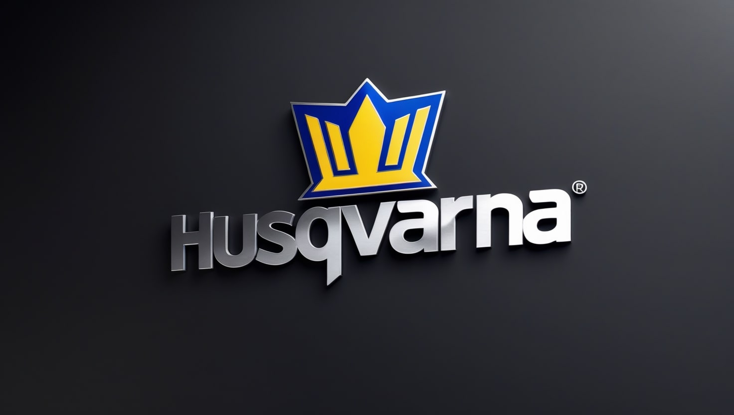
While tracing the Husqvarna logo history, one of the most striking moments for me was the 1983 change that gave the logo its modern identity. A sleek, stylized emblem emerged, featuring a blue crown with the letter H at its heart—an elegant symbol that instantly caught the eye. Just below it, a clean title-case inscription brought balance and clarity to the design. This version wasn’t just a rebrand; it was a heartfelt tribute to the original brand image, which had been present since the 1680s, now refreshed for a new generation.
In 2012, the logo was revised once again to align with modern branding sensibilities, and I clearly remember noticing the subtle yet powerful shift when I first saw it. The once bright blue color was softened into a darker shade, creating a sleeker, more mature presence. The updated wordmark displayed “Husqvarna Group” across two levels beneath the familiar crown, giving the overall image a distinctly professional, even expensive look.
One of the most interesting parts of the Husqvarna design evolution, in my view, is the logotype used in the modern era. It features a clear and distinct sans-serif font, drawing inspiration from typefaces like Sequel Sans and Shapiro Max Heavy, which give it a bold, contemporary feel. The blue and white color palette isn’t just for looks—it symbolizes protection, reliability, and high quality, values that perfectly match the brand’s identity today.
When was the first Husqvarna logo designed for motorcycles?
In 1912, the first Husqvarna motorbike logo was unveiled.
What does the blue in the Husqvarna logo signify?
Blue is a color that stands for safety, dependability, and excellence.
Who currently owns the Husqvarna brand?
Currently from 2013, KTM AG is the owner of Husqvarna, which has its main office in Austria.
How has the Husqvarna logo evolved over the years?
It now has a stylized blue crown with the letter “H,” signifying its lengthy history and contemporary brand identity, instead of monochromatic writing with a Gothic monogram.
I love motorcycles, bikes, and dirt bikes. There’s something exhilarating about the roar of the engine and the sense of freedom that comes with cruising the open road. Whether it’s the sleek design of a sports bike, the ruggedness of a dirt bike tearing through the trails, or the classic allure of a vintage motorcycle, every ride offers a unique experience. The adrenaline rush from leaning into curves or tackling off-road terrain is unparalleled. Riding is more than just a hobby for me. It is a passion that strengthens my soul and brings me immense joy